Soch
Soch is a one-stop brand for all ethnicwear. Housing everything from designer apparel to elegant fashionwear Soch has grown to retail through over 125 exclusive brand outlets across 49 cities.
With such a large offline presence Soch decided to bring their woefully dated ecommerce experience up to date. When Soch approached the studio to revamp their online store, we embarked on creating a modular website that could be adapted from one fashion season to the next. With a mobile first approach we created a reasonably future forward ecommerce experience.
Creating a Design System
A key takeaway from the kickoff workshop was the fact that Soch, like most fashion labels, is a constantly changing collection of products. We decided to create a set of modules for the Soch team to customize based on what works best from season to season.
The module library was articulated so that the Soch team could easily use it to keep the home page dynamic while also allowing them to link to the relevant category pages.


Expanding the Look & Feel of the Brand
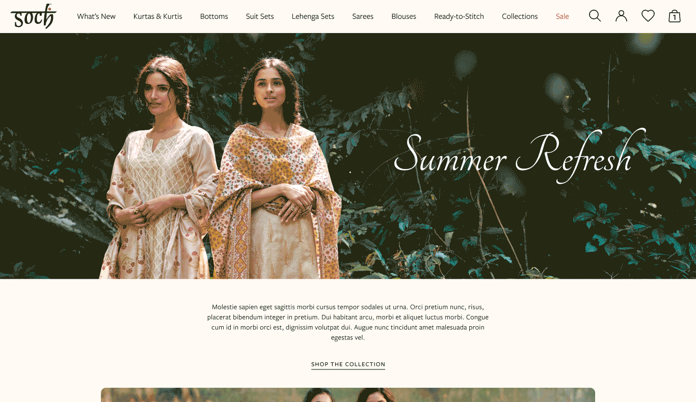
The goal of the redesign was to craft a unique digital look and feel for Soch. The brand wordmark with it’s iconic black and red proved a limited palette this exercise. Keeping in mind their products and ethnic bent of design we chose a set of neutral beige colours which would complement their product line while adding a much needed stand out factor.
For the primary typeface we selected Freight Neo, a new age traditional font which worked well with their Devnagari wordmark. This was limited to titles, select buttons and callout sections. For the secondary typeface we selected Freight Sans which complemented the primary font while also working well for extremely small text, large descriptions and product labels.


Navigation
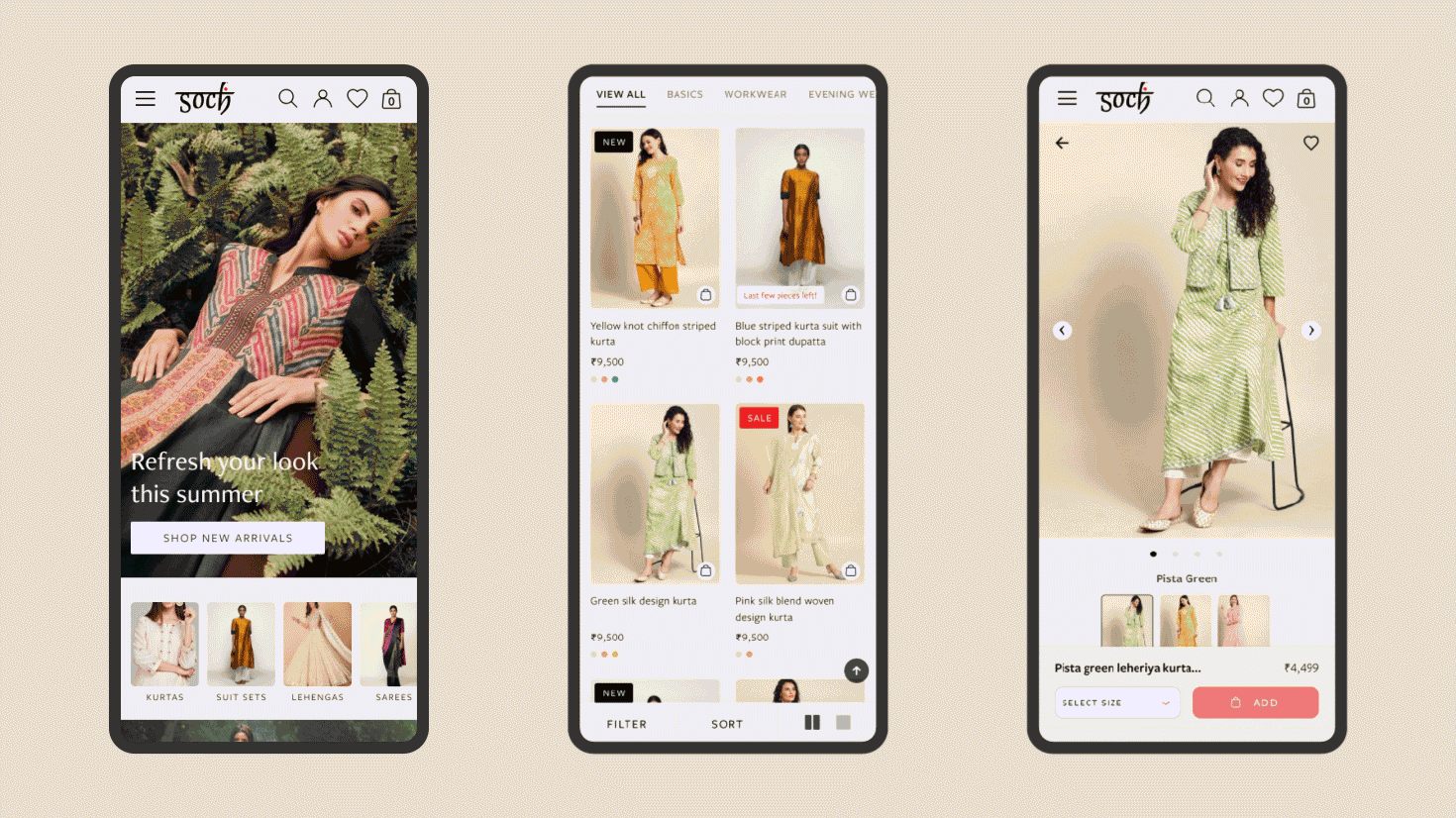
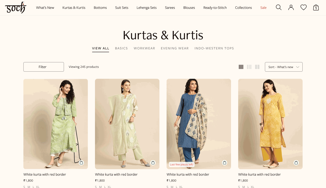
Given the large number of product categories we designed a two level navigation as the main menu. This adapts to a condensed menu as a shopper scrolls on any given page. The footer menu was designed to house a variety of informative pages classed under easy to scan heads. This way users could find them when they needed it most.


Home & Product Pages
The core ecommerce pages was designed in a modular fashion to afford Soch the flexibility to create a dynamic home page that could be changed based on the current season or collection.
Home Page - Wireframe

Home Page - With Visual Design

Cart & Checkout Pages
We wanted to ensure that users could view all their personalisation selections easily through their cart to ensure that they recieve the right products.
The cart and checkout screens were designed to account for a myriad of scenarios to ensure an ideal consumer experience.


User Account Pages
Soch wanted to use the opportunity of a design overhaul to work on their backend processes as well — especially their order tracking and notifications.
The user account pages were thorough and the UI design had to account for substantial number of edge cases.

Branded Pages
Besides the core ecommerce pages, Soch needed supporting pages for look-books and collections, seasonal sales and promotions and their rewards program.